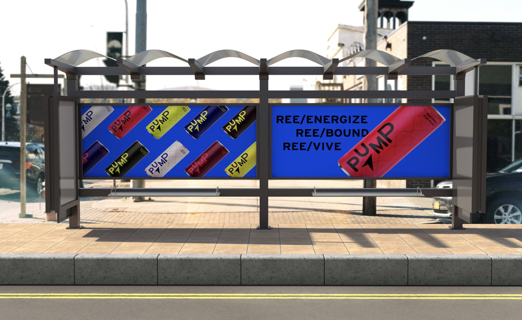
“Pump” Energy Drink Line by Reebok
This project was all about brand activation and creating a new product line and its brand identity for a company that I really respect.
PROCESS
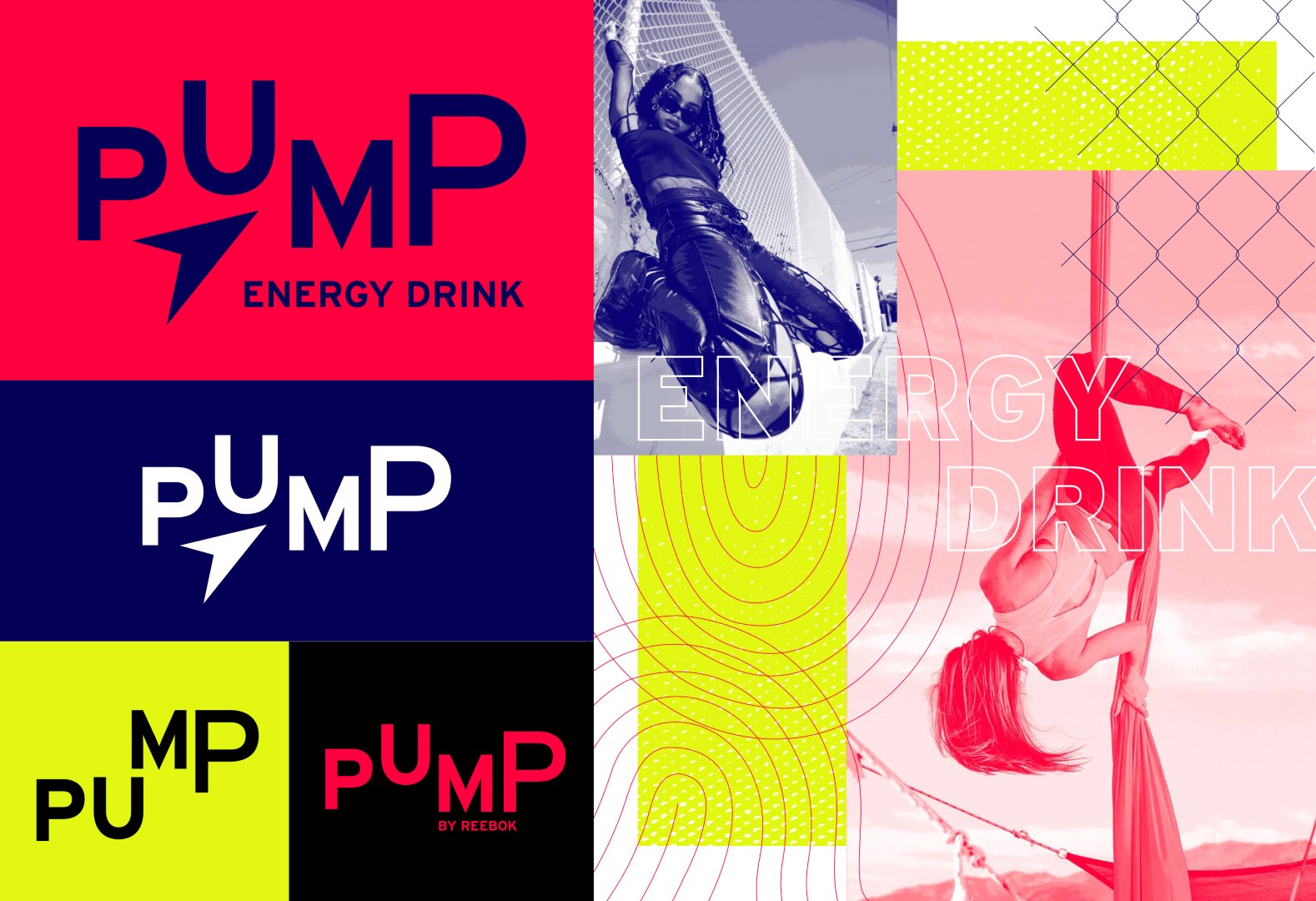
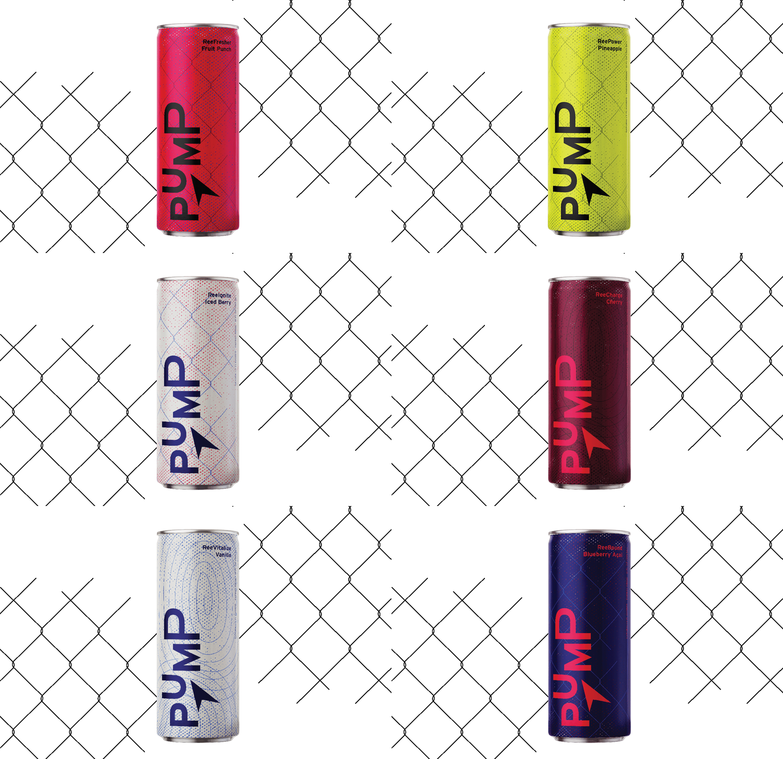
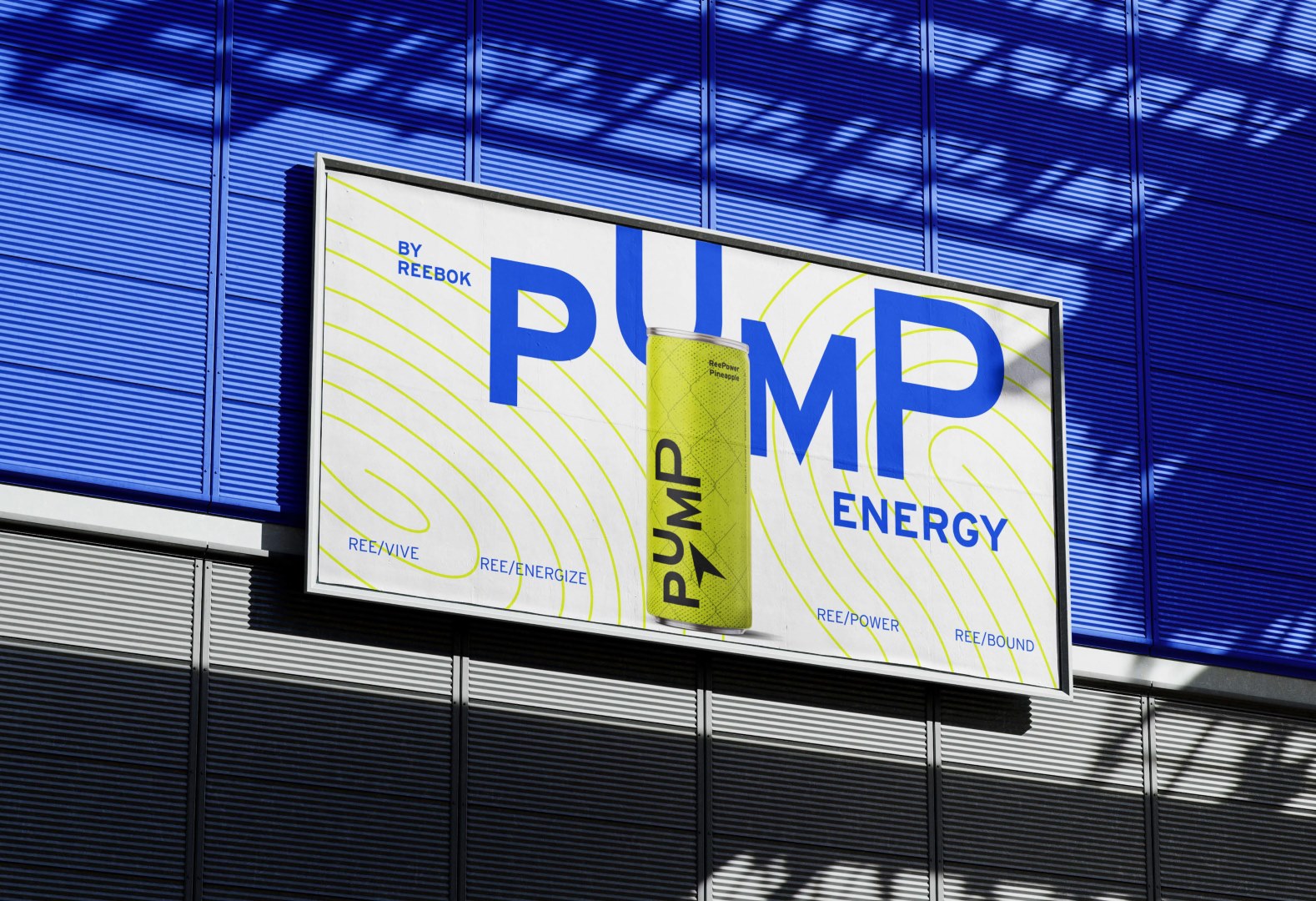
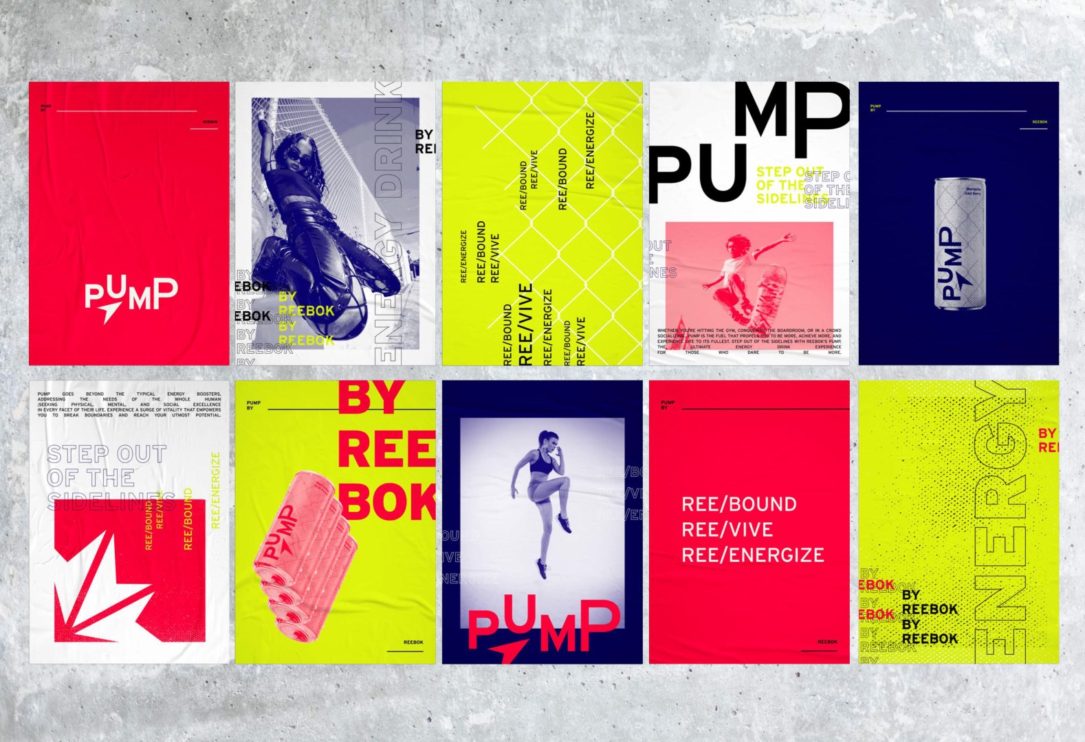
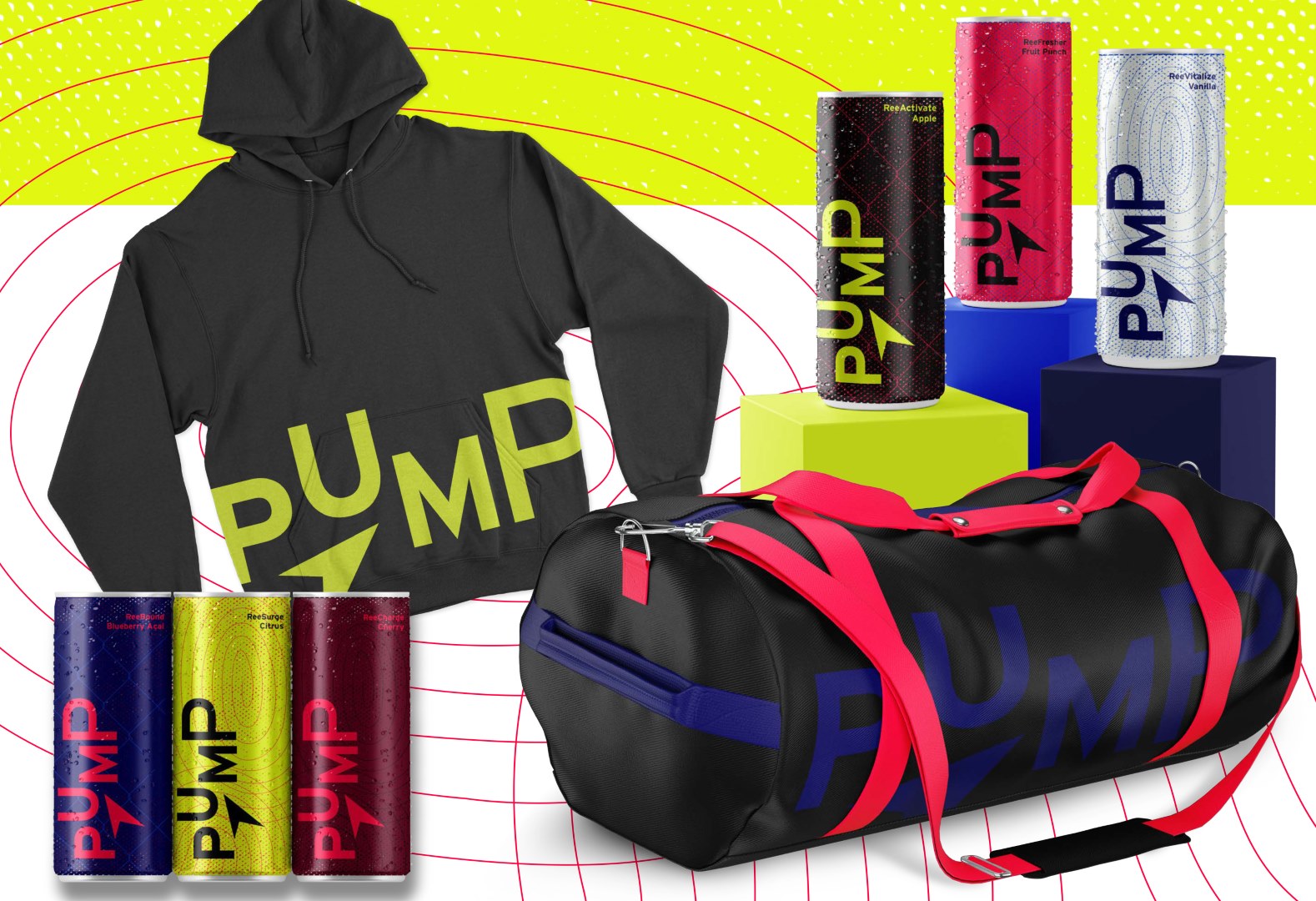
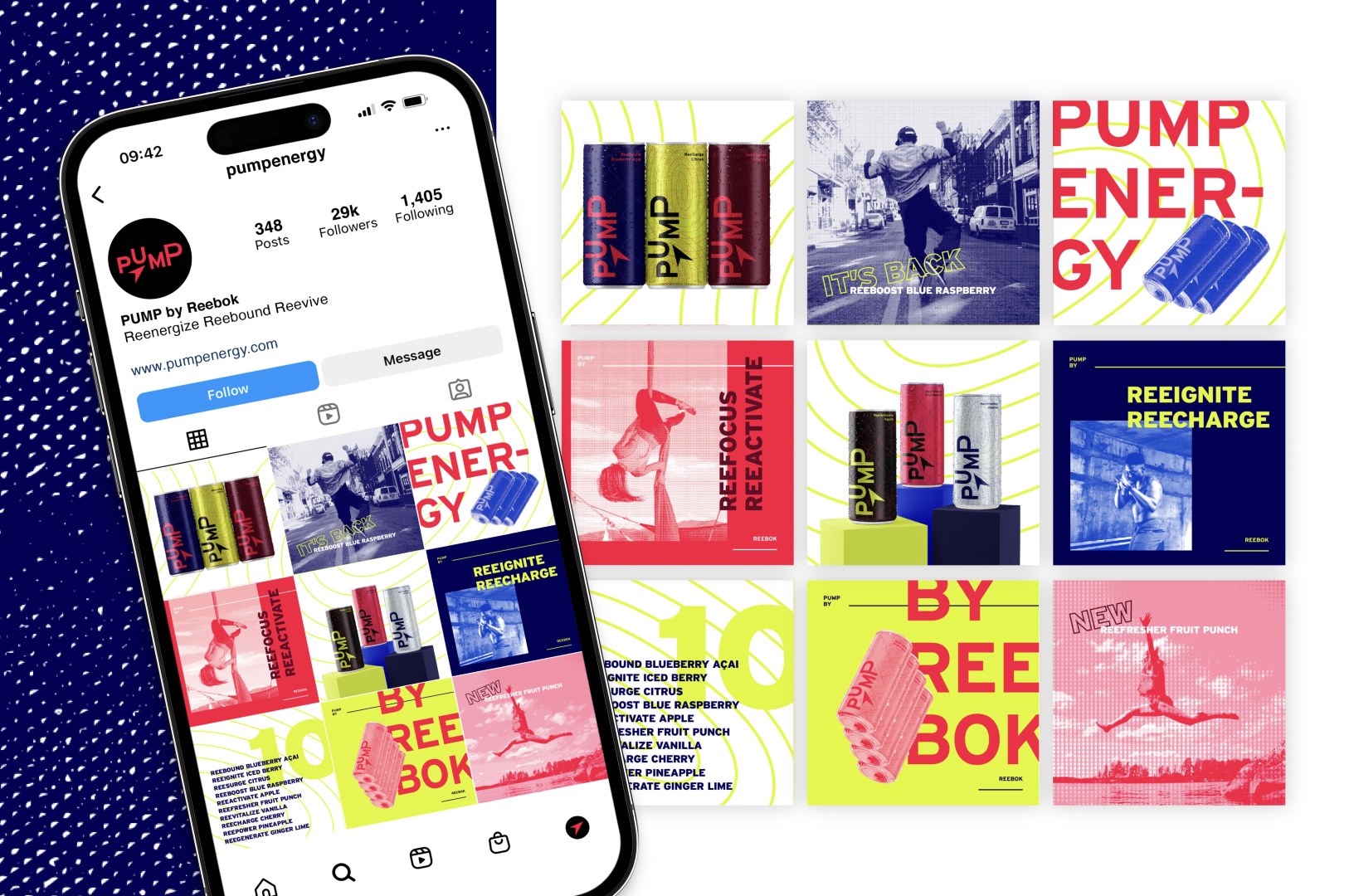
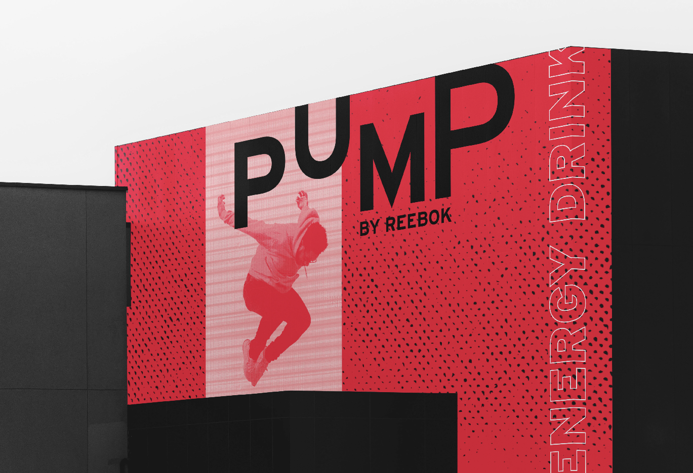
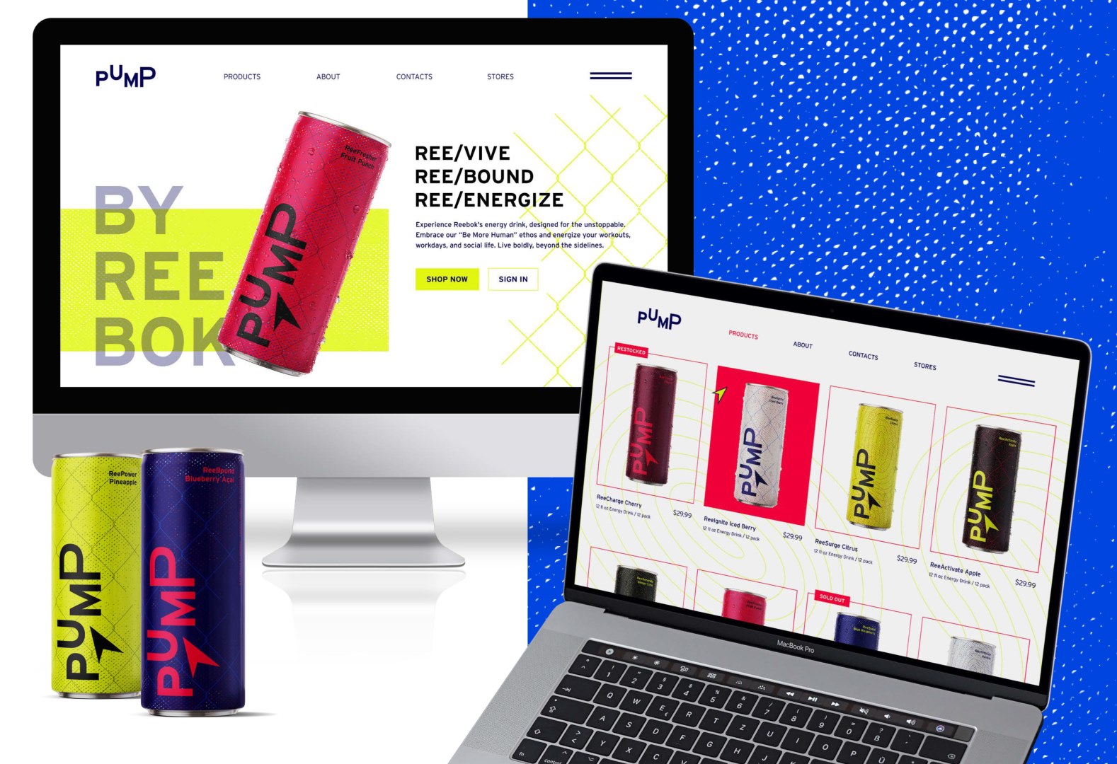
I decided to create a new line of energy drinks by the brand Reebok, as I thought it was a unique idea considering many sports clothing brands hadn’t dipped into the energy drink line, especially since energy drink brands are their own entities. I researched Reebok’s brand history and decided to name the energy drink line “Pump” as an ode to its famous retro pump shoes and for the high energy it conveys. Since Reebok as a brand markets itself as being for the everyday athlete, I wanted Pump to reflect this idea of individualism by not being tied to any specific sport or athlete while still standing out on the store shelf. This led to a brand identity focused on bright, vibrant colors and layered textures. The final product was a lineup of 10 different energy drink flavors, each one featuring a unique can design and flavor name, such as ReeFresher Fruit Punch or ReeCharge Cherry.
DETAILS
* BRANDING, ADVERTISING
* USING ADOBE PHOTOSHOP, ADOBE ILLUSTRATOR, ADOBE INDESIGN
